Blog · November 4, 2026 · 4 min read
How to choose an art style for your indie game
Pick a look your team can finish. Five questions to ask, the styles small teams ship with, and real examples, several made by one to five people.
The best art style for an indie game is one your team can finish to a high standard. Many small games stall because they picked a look that needs a big art team, and the art was never finished.
Some of the best-reviewed games on Steam were made by one to five people, using styles their teams could handle. Below are five questions to ask, then the styles small teams use most, with real games from the dex as examples.
Question 1: Who's making the art?
Your art style depends first on who will make the art.
- No dedicated artist. Pick a style where shapes and color do the work: flat design, vector art, minimalist or low poly. These reward good taste more than drawing skill.
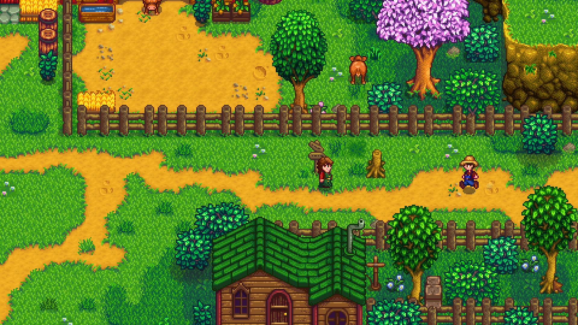
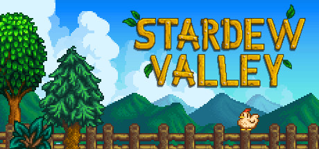
- One artist. Pixel art and stylized low poly are styles one artist can finish. Stardew Valley was drawn, coded and composed by Eric Barone alone.
- A small art team. Hand-drawn 2D or painterly 3D become possible, but animation will still take most of the art time (see question 2).
Question 2: How much will you have to animate?
Most of an art budget goes on animation. A character with eight directions and twenty actions is 160 animations before you've drawn a single enemy.
Styles that cut animation work:
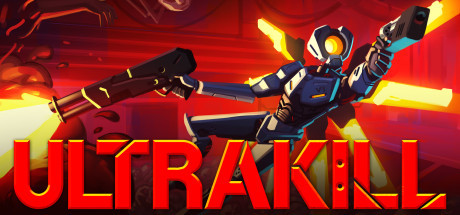
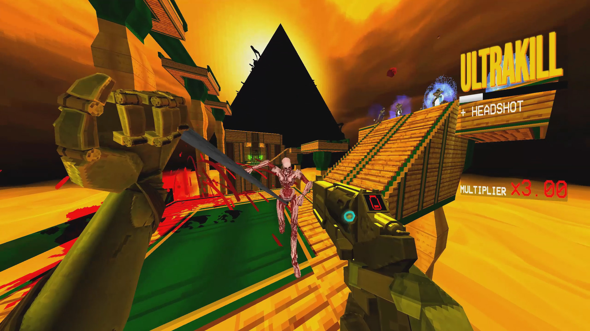
- First-person views. You mostly animate hands and weapons. ULTRAKILL and Lethal Company both put the camera in the player's eyes.
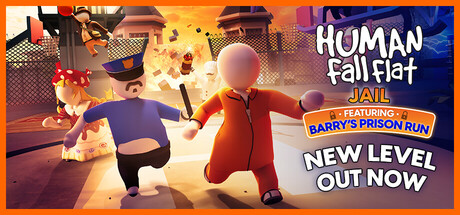
- Ragdoll physics. Human Fall Flat, started by a single developer, lets physics animate its wobbly characters. The blank, doughy look makes the floppiness charming.
- Tiny figures. At micro pixel scale, a walk cycle is a few frames.
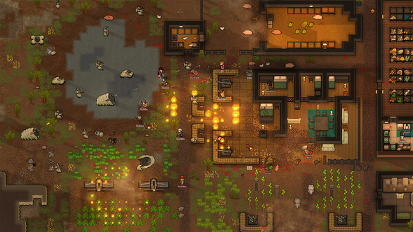
- No limbs at all. The colonists in RimWorld are seen from above, with no arms or legs. At that zoom level they read fine, and the game saves a huge number of animation frames.

Question 3: What does the game need players to see?
Your genre makes demands on your art. Fast action needs characters that stand out from the background, while horror often works by hiding things.
Two games show opposite approaches:
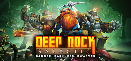
- Deep Rock Galactic uses chunky, low-poly caves with strong colored light, so you can always tell rock from crystal from enemy, even in a swarm.
- Mouthwashing uses a crude, low-resolution PS1-era look, which makes faces just unclear enough to be unsettling.
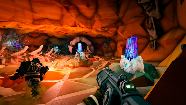
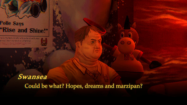
Neither look needs detailed models or textures, and each suits its game better than a realistic one would.
Question 4: Where will people play it?
Small screens favor bright colors and big, simple shapes. In our data on 1,250 games, 68% of mobile games have a saturated palette, against 32% of Steam games. If you're making a phone game, a dark, detailed look will fight the screen. On PC, the dex's best-reviewed games cover every style from 1-bit to photoreal.
Question 5: How do you want it to feel?
Players pick up a game's mood from its look before they read any text. Try describing the feeling you want in five words, then search for it. StyleDex's describe search matches a sentence to games' looks: try cozy rainy village with warm lamps or foggy pine forest at dusk.
The styles small teams ship with
These styles show up most often among small-team games in the dex.
Stylized low poly with good lighting
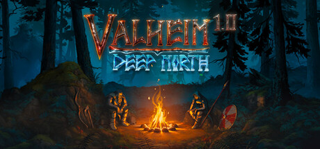
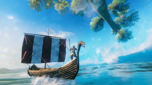
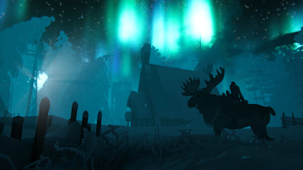
This style uses simple models and puts the effort into lighting. Valheim launched from a team of five, using low-poly models with low-resolution textures. Fog, low sun and reflective water make its forests and coasts look moody despite the blocky models.
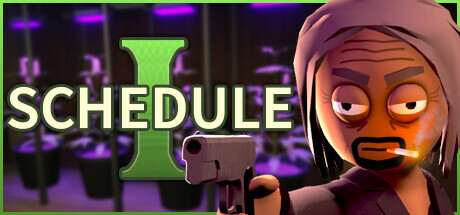
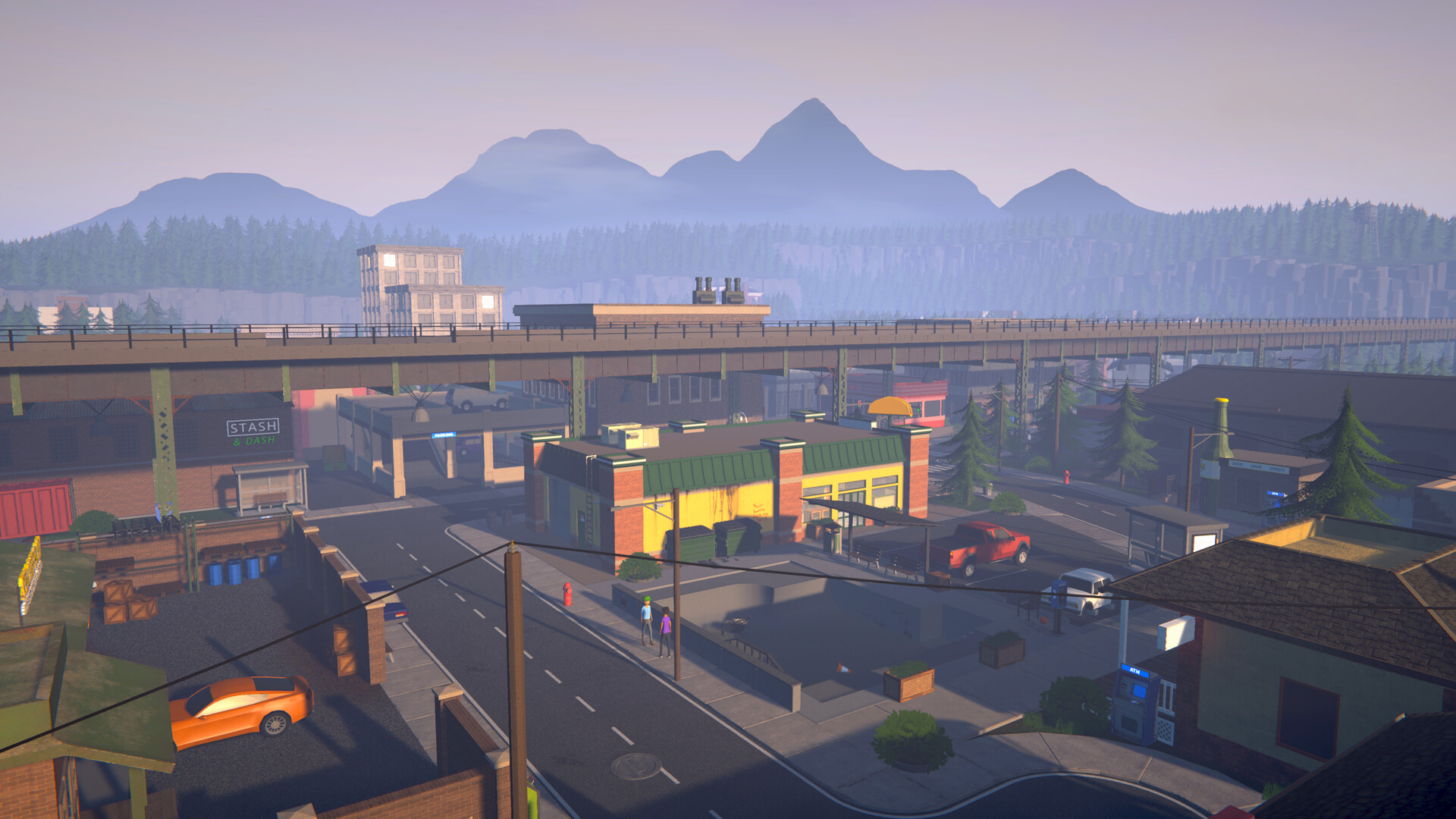
Schedule I, made by one developer, uses the same idea with plain, smooth low-poly people and cars.
Browse more: low poly (67 games), chunky stylized 3D (44 games).
Retro 3D
Low-resolution textures and simple models, often borrowing from the PS1 and PS2 years, are now a deliberate style rather than a hardware limit. ULTRAKILL uses them for a frantic shooter with harsh red, orange and yellow arenas. Rough edges look deliberate in this style, so small mistakes don't show.
Pixel art
A common choice for solo developers, and the best-reviewed style in our data. Pick a resolution and color limit early and stick to it. Our pixel art guide covers the styles from 1-bit to HD.

Flat and minimal
Flat and minimal styles use clean shapes and only a few colors, and puzzle and strategy games use them most. Baba Is You draws everything as small wobbly sprites on a dark background. RimWorld uses flat top-down shapes so a colony stays readable at any zoom.
Build a moodboard before you draw
Before committing, collect 10 to 20 reference games and look at them side by side. You can do it on StyleDex in a few minutes:
- Filter by tags. Start with one rendering tag, then add a palette or mood. Every pair of tags with enough games has its own page, like low poly with heavy fog.
- Search by color. The palette button next to the search box finds games whose screenshots contain a color you pick.
- Find relatives. Each game page ends with "This style's relatives": the games whose screenshots look most like it.
- Exclude what you don't want. Filters can exclude tags too, so you can ask for pixel art that isn't dark.
When your moodboard looks consistent, write down three rules for your art: a resolution or poly budget, a palette, and an outline rule (none, thin or thick). Sticking to those three rules keeps the art consistent as you add assets.
The short version
- Choose a style your team has the skills and time to finish.
- Count animations before you commit.
- Make sure players can see what the game needs them to see.
- A simple style applied consistently looks better than a realistic one left unfinished.